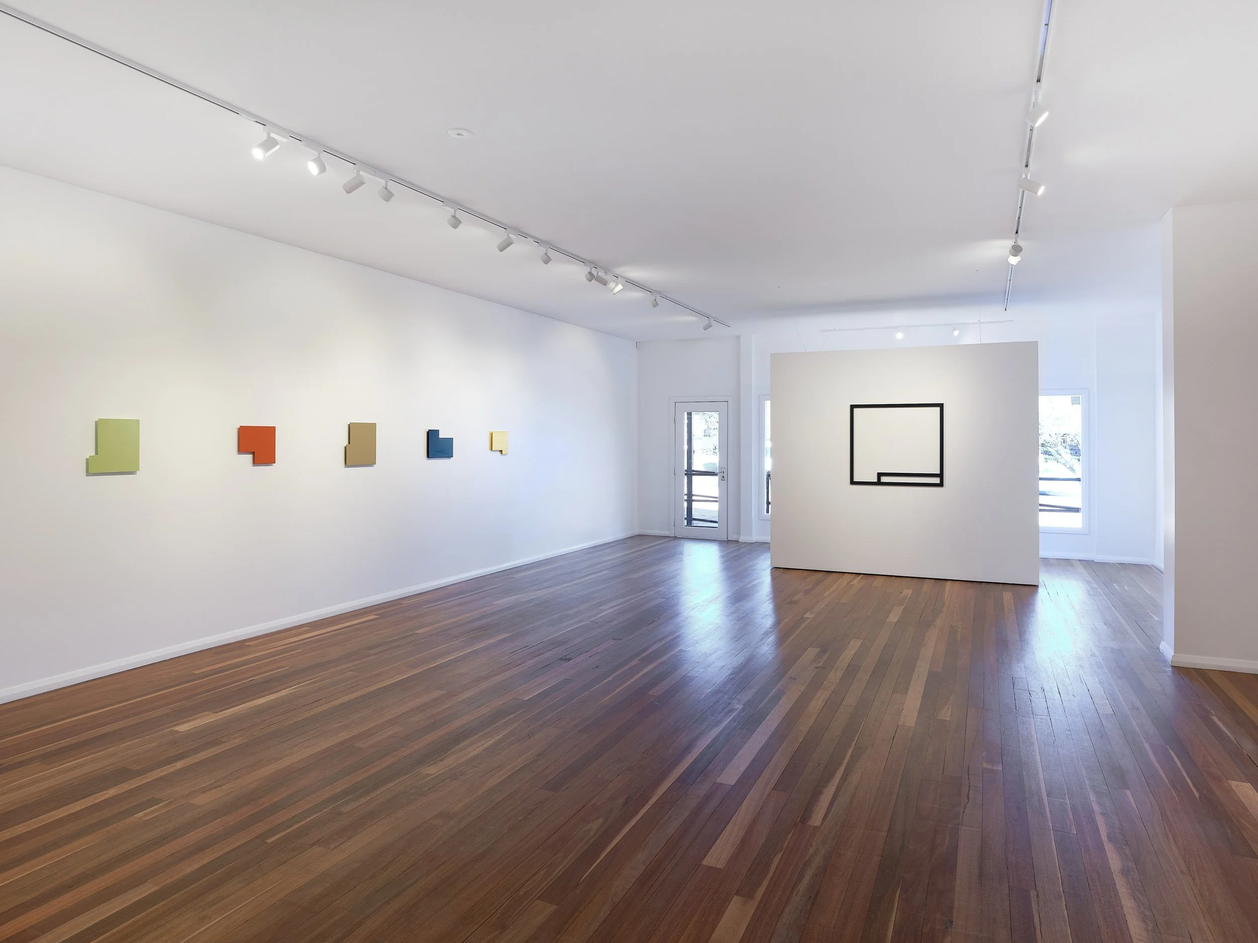
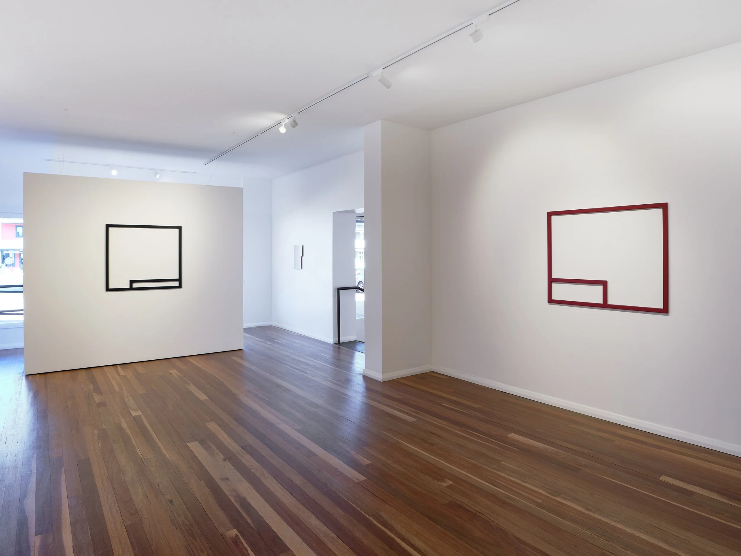
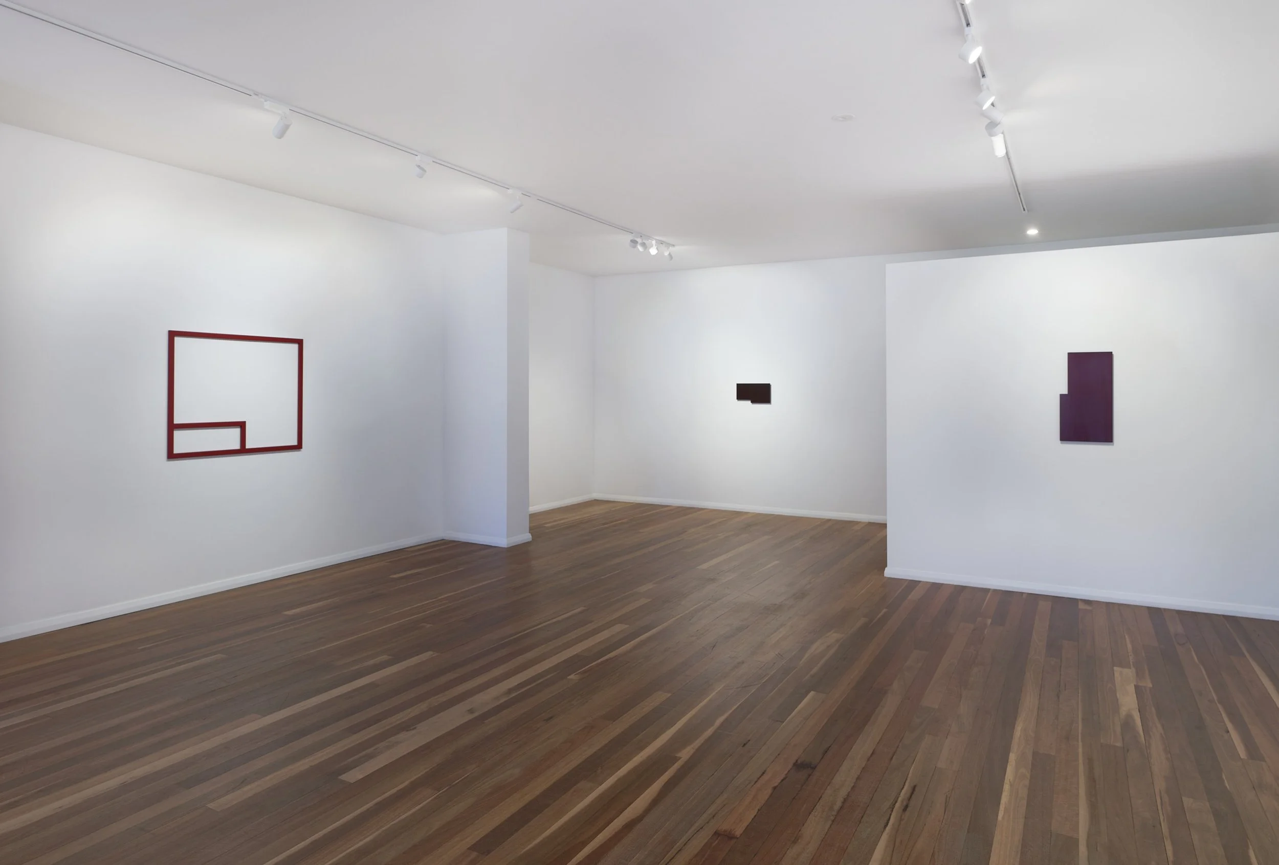
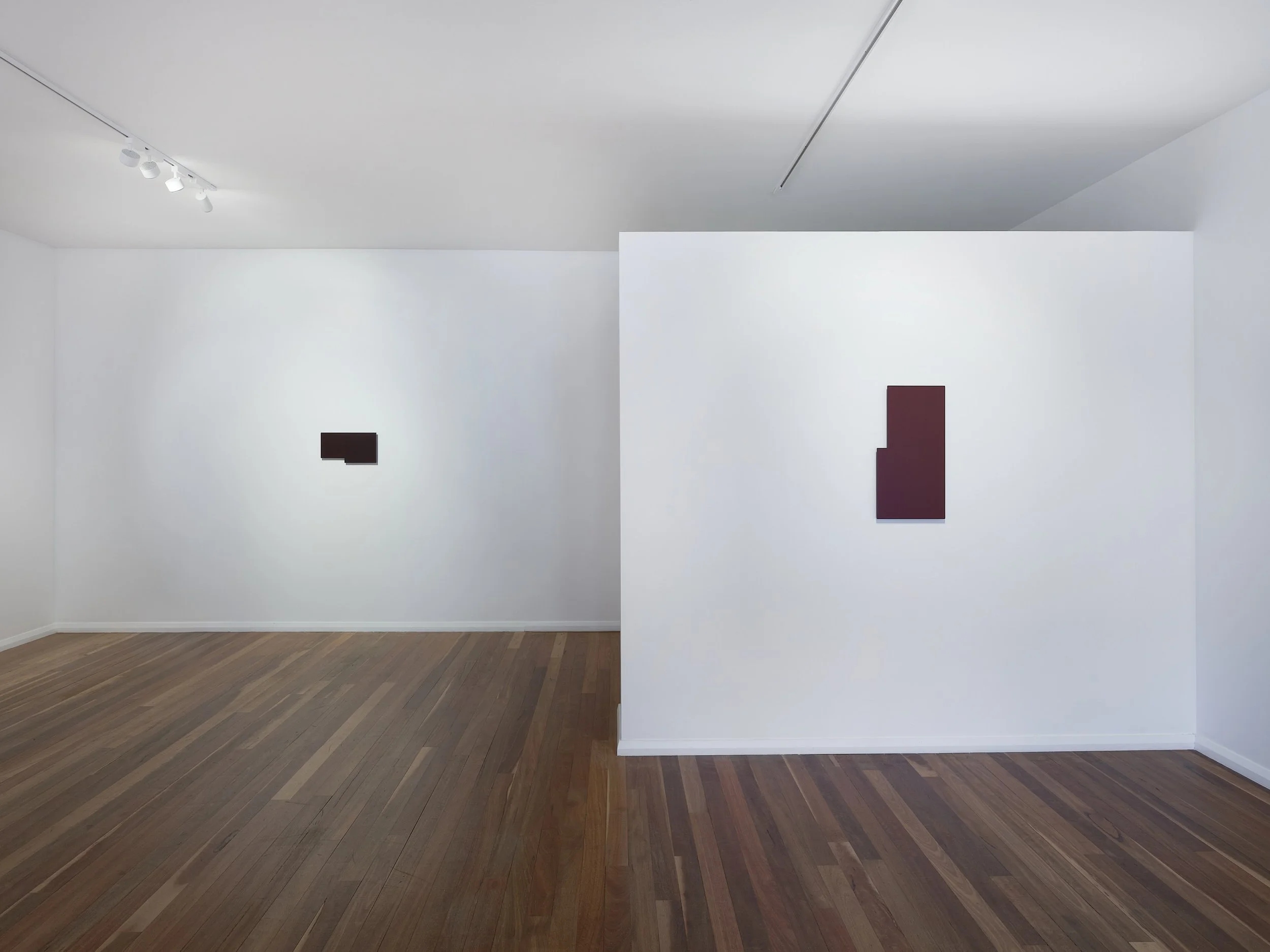
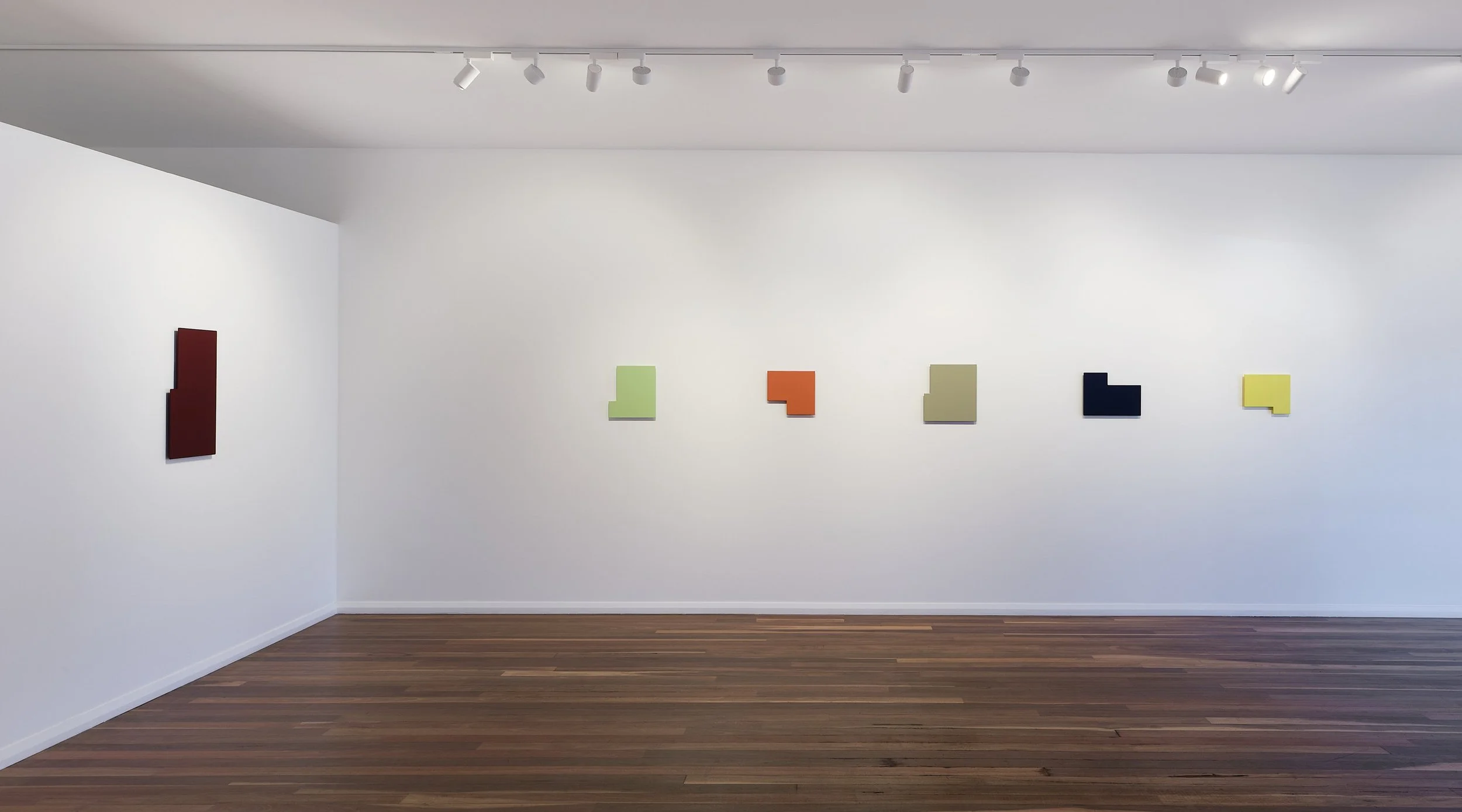
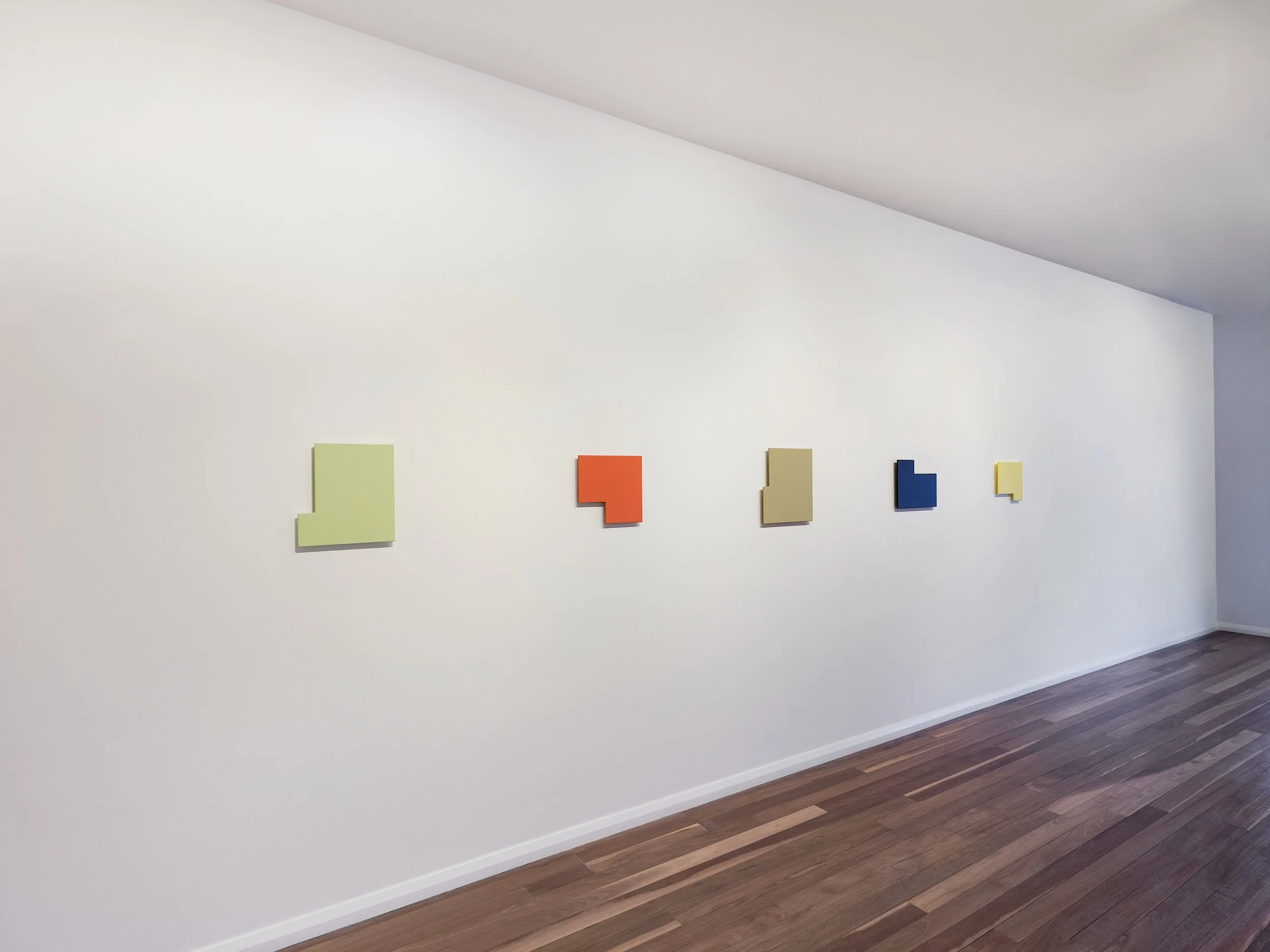
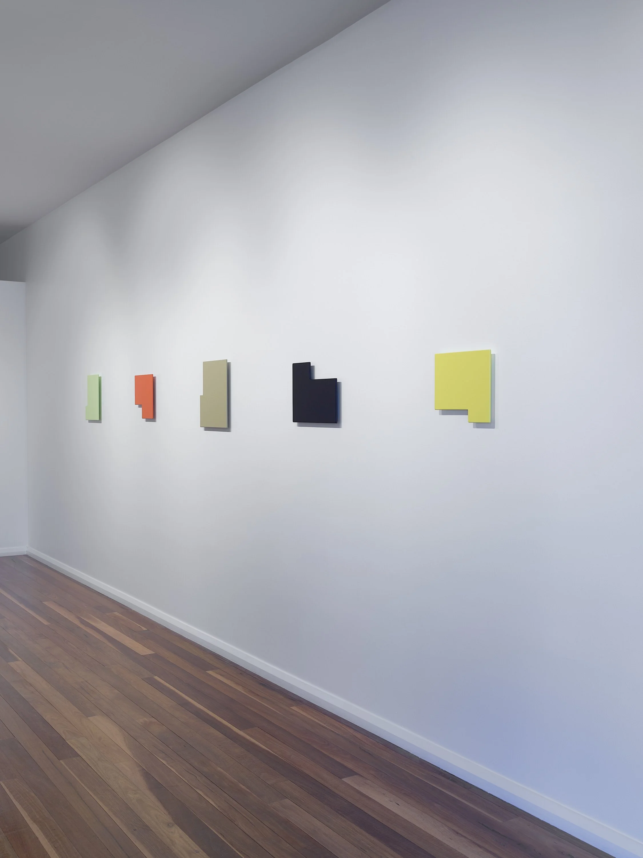
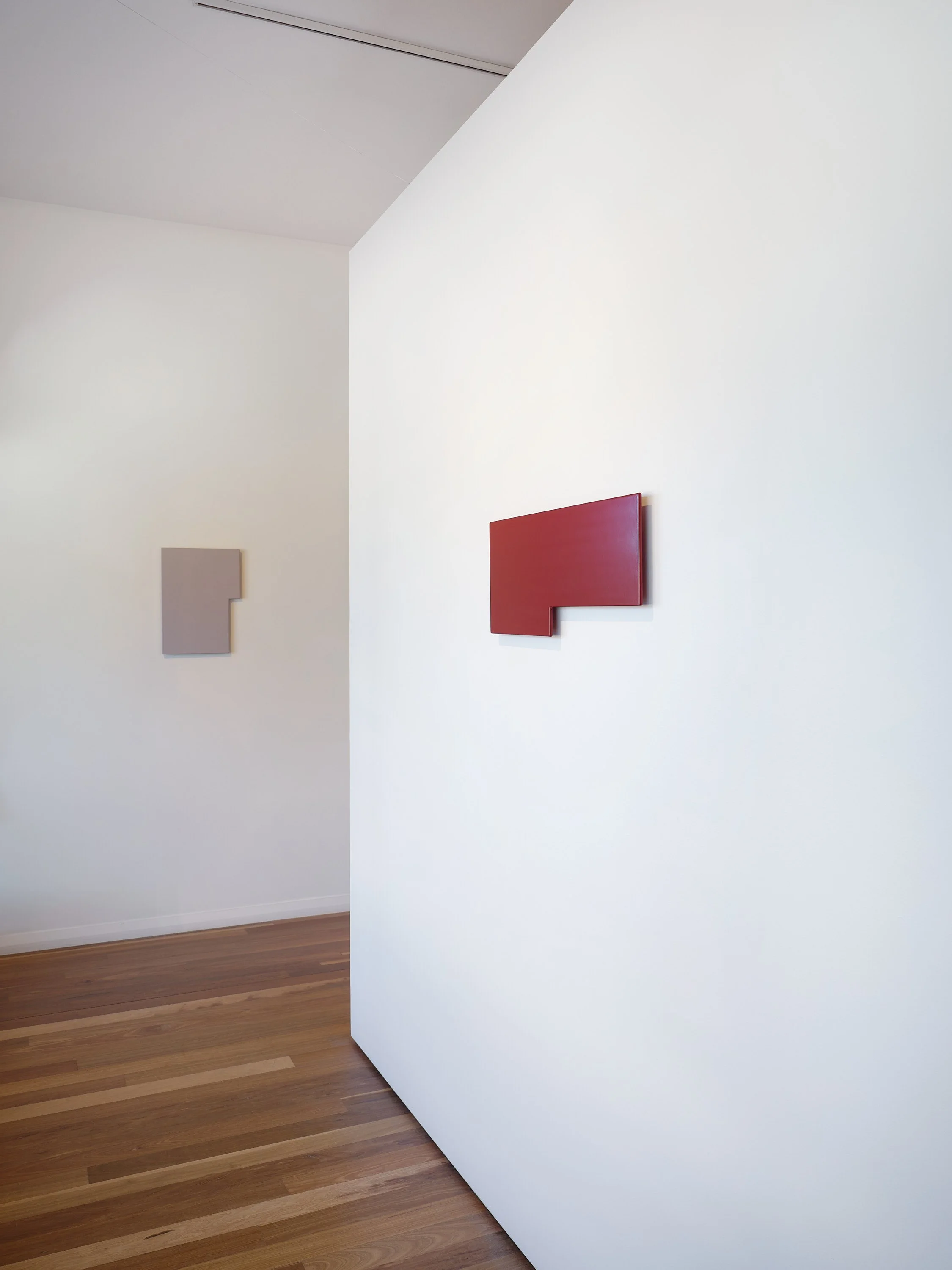
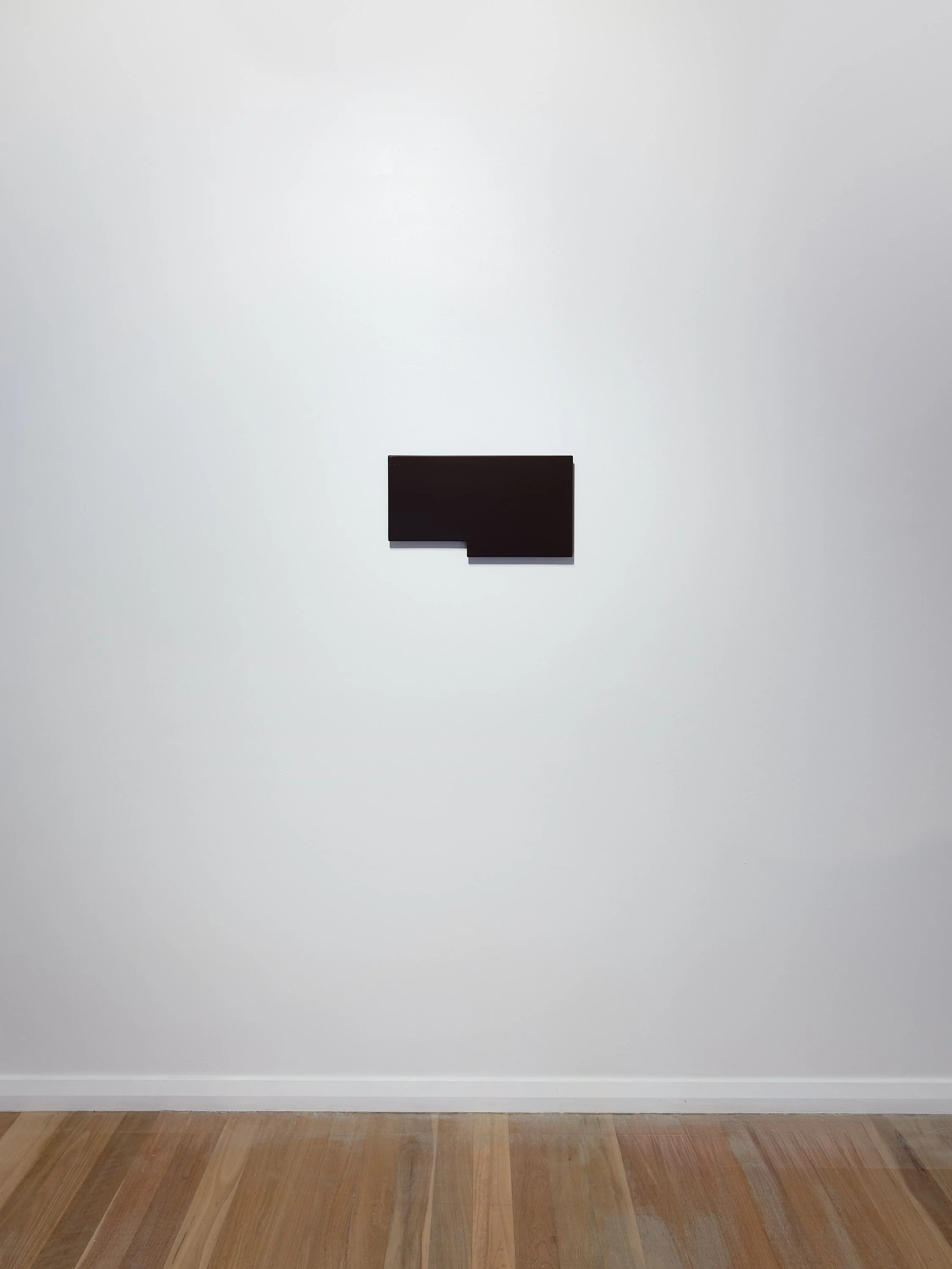
A shimmer of movement and light shatters the field of colour, as the surrounding environment is imaged back at itself. A pool of burgundy that breaks like the meniscus as a droplet returns with gravity. The exchange offering up its own complex surface, with its love and meticulous crafting, monochromes that place colour on an even scale with cut shape. Your eye traces the forms, following their jutting and protruding geometry as you look for a sign of hand. A variance in surface, a potential mottling or raised stroke. Idiens’ marks are different in these new works. A kind of return to the hand, but still with it concealed. Where Donald Judd would stop at the drawing, Idiens has cut her MDF sheet, lovingly sanded and filled, working her way down the grades of paper to an almost polished MDF. Colour layered over and concealing her careful preparation, laid down as a misting of fine spray with further sanding, between coats. They may step away from the logic of Judd’s outsourced production, but maintain an ‘objectness’ that places them between painting and sculpture, while allowing the surfaces a little more life than those that have previously been outsourced. ‘Form & Colour’ continues the lineage of minimalism in the vein of Judd, as well as artists such as John McCracken, Anne Truitt, and Robert Mangold. It is a show that allows for a little humanness and warmth to enter the conversation, alongside the ability of the objects to welcome their environment through their dynamism. The title may be a succinct and literal summary but these pieces are so much more than this description, they are everything that one brings to the viewing and they allow an escape from the world that they bounce back at you.
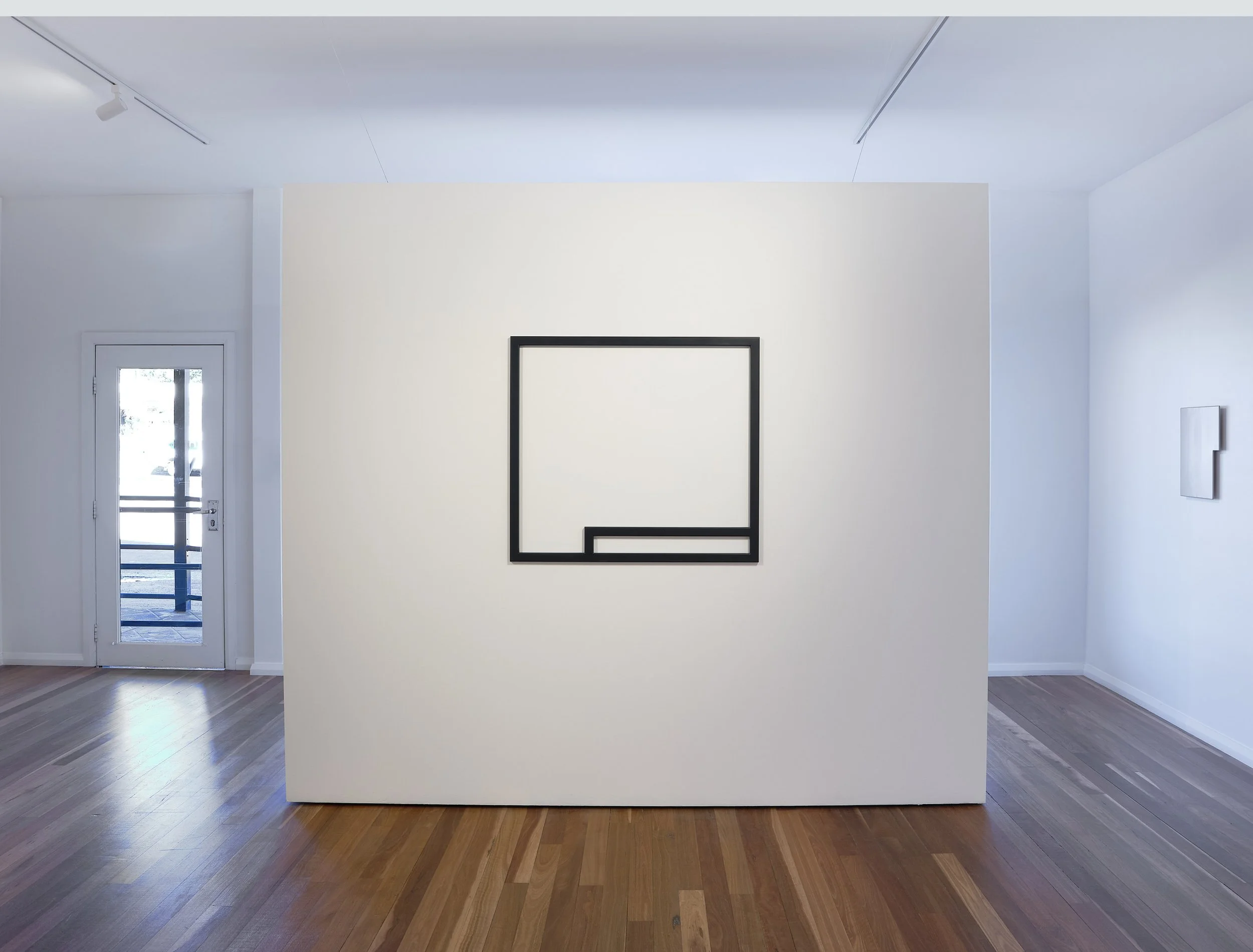
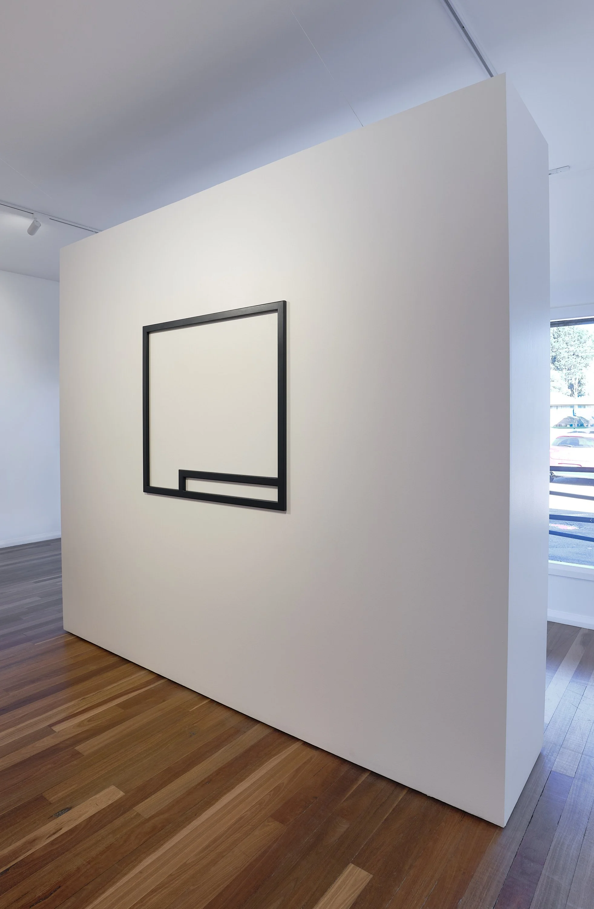
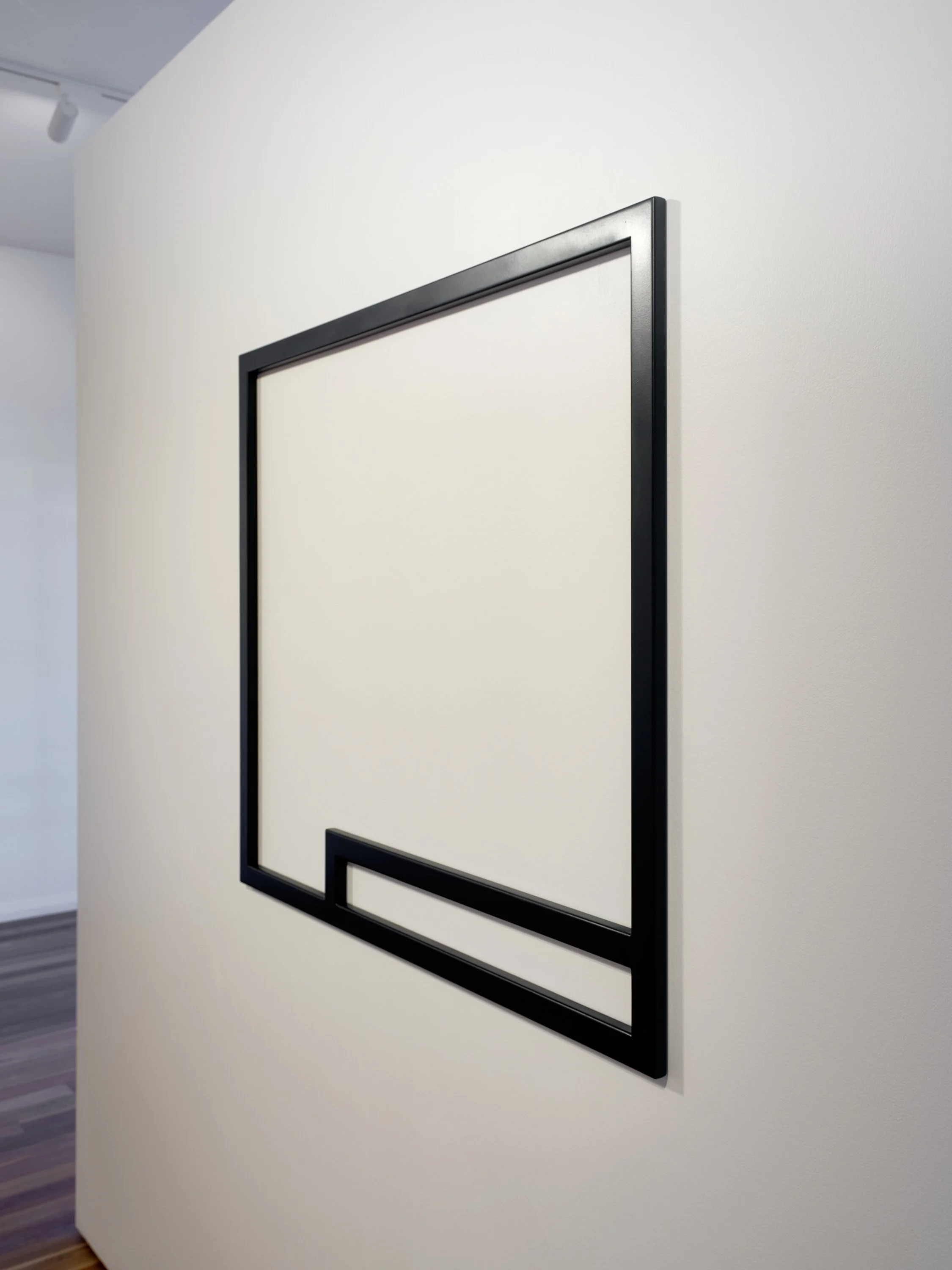
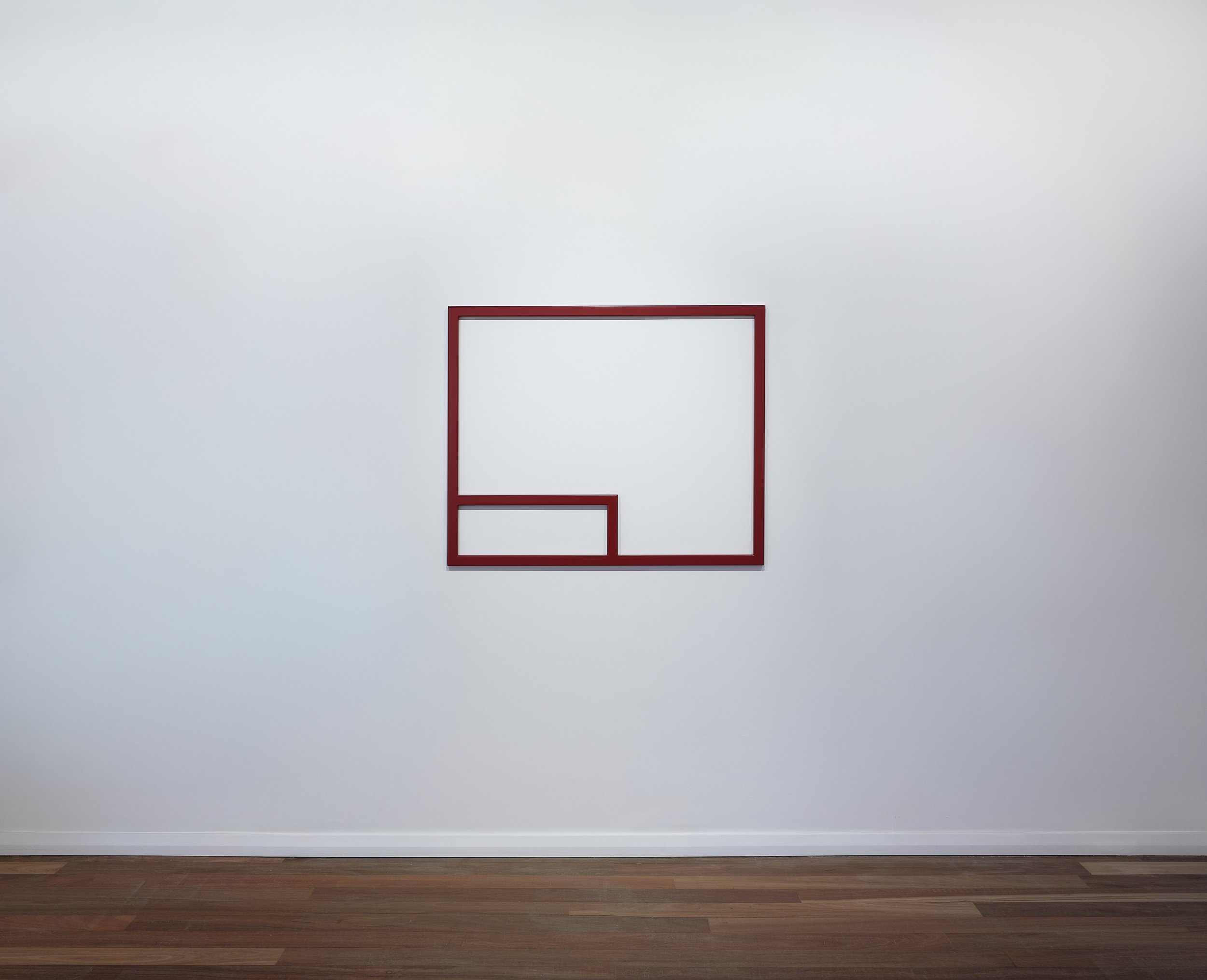
There is a chill in the air that is fought off by the active motion and controlled honing of her forms. Idiens bunkered down in her studio obsessively working her way through the grades of sandpaper. ‘One eighty’ to ‘two forty’, iron wool, to ‘wet and dry’ paper, and then onto the ‘six hundred’ and finally the ‘twelve hundred’. It’s a caressing and preparation not found in most painting practices, one that would more likely sit in relation to fine cabinetry work or trophy polishing. This treatment follows the hand-cutting of the form. It is important to Idiens that the form acknowledges a reduction, that the final piece reads as a shape that has had a portion removed, and that the void remains as an integral element of negative space in relation to sculpture. This logic is more clearly acknowledged in Untitled (Deep Blue Frame), 2026 and Untitled (Red Frame), 2026 where a section is delineated from the whole. Space carved up in such elegance and these pieces in their ‘wire-frame’ format lean towards sculpture, with the reduction of the field and activation of the wall. In the other pieces the edges are carefully curved by hand-sanding and then once she has followed the path of preparation, pile of worn-down sand papers to the side, the form is ready for colour. Her forms are repeated with minor variation. Often scale, dimension, orientation all playing a significant role in how the work comes to be. To Idiens, as her ‘Warriors and the Missing’ titles suggest, they are almost in battle, perhaps having lost a part but carrying on. I see a puzzle or a greater geometry that they sit into, and when read as a suite on a wall, suggestive of an alphabet of symbols.
I feel privileged to have seen her drawings for these pieces. One might imagine a loose sketch, similar to that of a Donald Judd but these were something else. They read like finished works, delicately rendered in coloured pencil and one would be forgiven for thinking of them as exhibition work. They brought to mind wood block printing, and in many respects reminded me of the hard-edged works on paper by Richard Serra, only with more colour. These early drawings are what set out the full process, at this stage, the orientation, the form, the colour are all carefully worked through, so that the following steps can be carried out without causing risk of damage to the front face of the works. Now ready for all that prep work to disappear under blankets of colour. The six millimetre, woody composite, sanded within an inch of its life and ready for saturation.
The colour in this show doesn’t feel random, like it was chosen to sit back or there as an after thought. We know from the above drawings that colours are decided in advance and in relation to one another. In this case the deep reds and navy open the pieces up to reflect more of their surrounds, the softer muted tones absorbing light and the primary of yellow and secondary of orange zing in a way that sits colour almost out in front of form. Idiens was mindful that the colour not dominate the shapes, that despite the ‘all-overness’ of the monochrome that the shape be allowed to breathe. Something that I love in this work, is that they read as hand-made, sanding and painting can be felt and seen in their surfaces and that keeping them in the studio and spraying them in the street, allows a warmth into the often clinical nature of minimalism. Despite being difficult to define, I think this approach has shifted the works closer to painting. Where there was more clearly wall relief in the past and outsourced spraying, the pieces read as objects. Here the hand allows for some mottled surface, some interruption to the sweeping fields of colour and some soul to find its way between the layers. Spray lines, or uneven drying, the backdrop of graffiti wrapped brick walls, sprayed from ground to roof top allowed for Idiens to carefully mist her forms, leaving overspray outlines added to the cityscape. Aerosol in conversation but a hyper contrast to the grit and grime of the tagged brick. Idiens continuing to work her way through more sand paper as the primer and paint layers go down. I can help but think, the little bits of almost microscopic dust on the air, settling into a drying layer and evading the fine grit paper, only adds to the spirit of the works. One can only obsess to a point, and Idiens started to feel that this way of working suited the feel she needed in these pieces.
‘Form & Colour’ offers up a reduction but also a return to the hand. Works that need to be viewed and experienced in person to fully appreciate the subtle and varied quality. There is an opening up to process and an evidencing of Idiens’ ability to romance the mundane. To lovingly work her way down the grades of sand paper and build her way up the number of coats of sprayed colour. To look for blemish or an inconsistency of surface as error would miss the point of this work. These pieces sit outside Donald Judd’s notion of ‘object’ and speak to both sculpture and painting with a humanness. They ask you to consider both the environment they sit in, the light they bounce back and absorb, and the voids that are created in the forming of their shapes. They have the slickness and at times a sheen that speaks to the work of John McCracken, but it is the return to the studio and the hand that softens this series of work.
James Kerr, 2026
For exhibition catalogue and enquiries please contact james@jenningskerr.com.au | +61 416 057 186
Jennings Kerr
Shop 4, 74-76 Hoddle Street,
Robertson NSW 2577
Friday - Monday 10 - 4pm
or by appointment